
Logos are a fundamental element of a brand's identity, serving as a visual representation that embodies its values, history, and aspirations. The Puma logo, with its sleek and iconic design, has become synonymous with athletic prowess, innovation, and style. In this article, we will delve into the fascinating history and evolution of the Puma logo, exploring how it has evolved over time to become one of the most recognizable logos in the world.
1. The Birth of Puma
The story of the Puma logo begins with the formation of the brand itself. Puma, originally known as "Gebrüder Dassler Schuhfabrik," was founded in 1924 by Rudolf Dassler in Herzogenaurach, Germany. The company initially produced footwear for athletes, emphasizing innovation and performance. In 1948, a family dispute led to the separation of the Dassler brothers, with Rudolf founding Puma, and his brother Adolf "Adi" Dassler starting Adidas.
2. The First Puma Logo
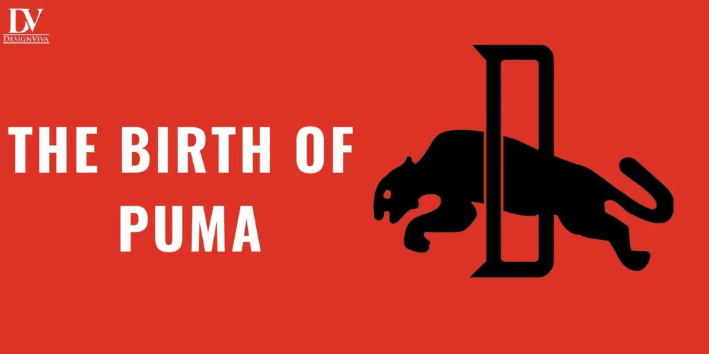
The earliest Puma logo, introduced in the 1940s, was a simple representation of a Puma leaping over the brand name "PUMA." This logo emphasized the brand's agility and speed, traits that athletes sought in their footwear. The combination of the puma silhouette and bold typography created a distinctive visual identity for the brand.
3. The Formstrip
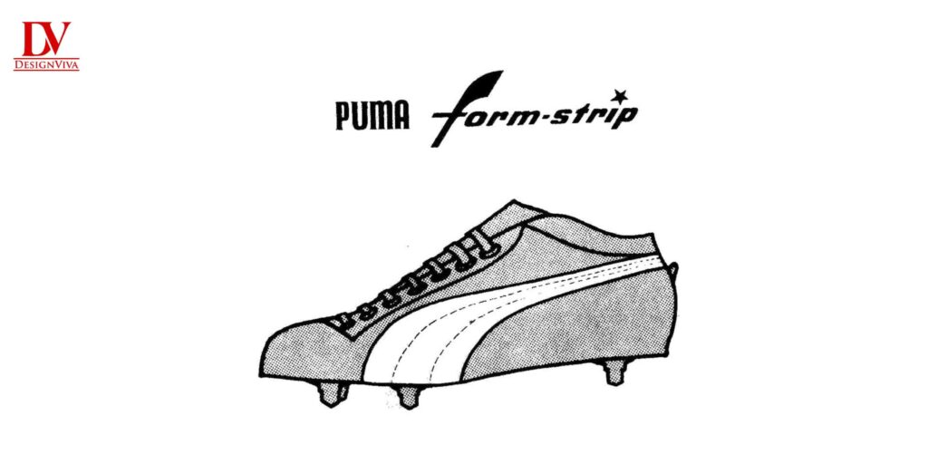
In the 1950s, Puma introduced the iconic "Formstrip" logo. The Formstrip, a horizontal stripe that appeared on the brand's footwear and clothing, became a hallmark of Puma's design language. This minimalist logo symbolized simplicity and elegance, traits that resonated with athletes and consumers alike.
4. The Golden Era and the Leaping Cat

During the 1960s, Puma enjoyed significant success, becoming a favorite among athletes and sports enthusiasts. It was during this period that the brand adopted the "leaping cat" logo, which is still in use today. The leaping cat logo features a stylized puma jumping across the brand's name. This design encapsulated the brand's essence, capturing the attributes of strength, agility, and dynamism associated with the puma.
5. The Logo Refinements
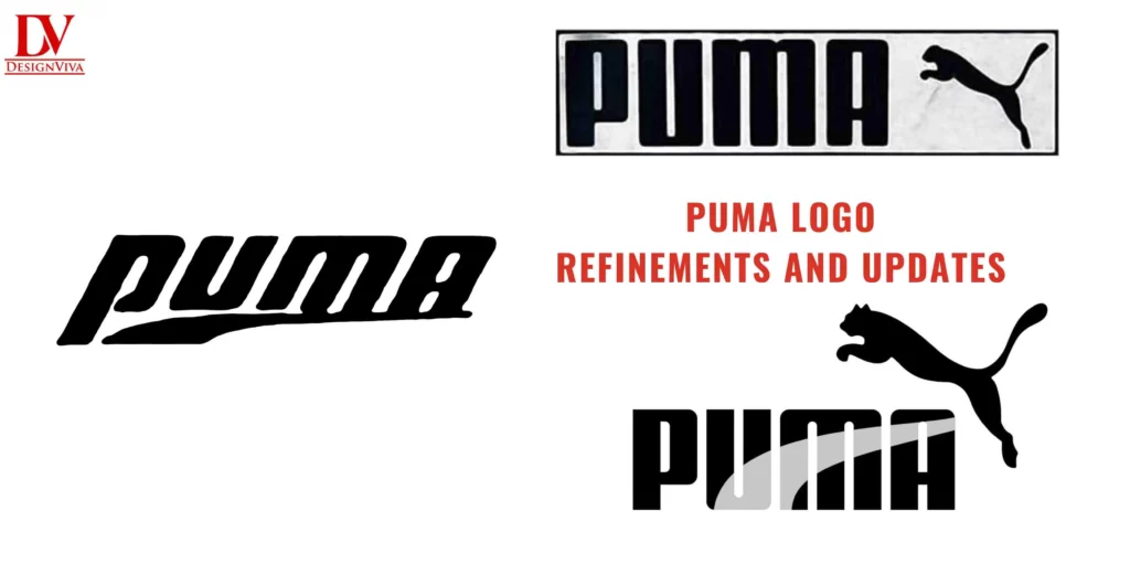
Over the years, the Puma logo underwent several refinements and updates. In the 1970s, the brand experimented with different color schemes and simplified the leaping cat design. The logo was often combined with the Formstrip, creating a cohesive visual identity for the brand's products.
6. The Modern Era
As Puma continued to evolve and expand its product offerings, the logo also underwent further revisions to adapt to the modern market. The 1990s saw a bolder and more streamlined version of the leaping cat logo, reflecting the brand's contemporary and edgy image. During this time, Puma expanded its reach beyond sports apparel, entering the lifestyle and fashion markets, while still maintaining its sports heritage.
7. The Emblem Logo
In the early 2000s, Puma introduced the "emblem" logo, which replaced the text "PUMA" with the image of a leaping cat enclosed in a circular emblem. This version retained the essence of the brand's identity while offering a more compact and versatile design that could be easily applied across various mediums.
8. Puma's Branding Innovations
Throughout the years, Puma has been proactive in using its logo to establish its presence in the global market. Strategic collaborations with renowned designers and celebrities have incorporated creative logo variations, keeping the brand fresh and appealing to diverse audiences.
9. Evolution to Flat Design
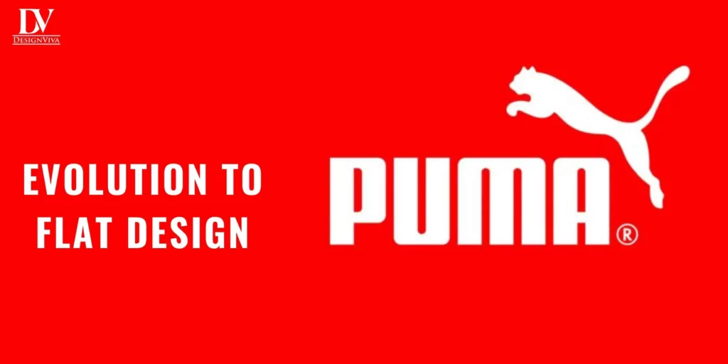
With the rise of digital media and the demand for minimalist aesthetics, Puma embraced the trend of flat design in the mid-2010s. The leaping cat logo underwent further simplification, shedding details to achieve a clean and contemporary look.
10. The Future of the Puma Logo
As Puma continues to adapt to the ever-changing consumer landscape, the future of its logo remains an exciting prospect. The brand's commitment to innovation and progressive design suggests that the logo will continue to evolve while staying true to its iconic identity.
Conclusion
The Puma logo is a testament to the brand's rich history and evolution. From its humble beginnings as a small German footwear company to its status as a global sports and lifestyle giant, the Puma logo has stood the test of time, resonating with generations of consumers worldwide. Through strategic design choices, the logo encapsulates the brand's values and personality, representing the agility, strength, and dynamic spirit of puma. As Puma continues to push boundaries and explore new horizons, its iconic logo will undoubtedly continue to be a symbol of excellence and inspiration in the world of sports and fashion.