
A well-designed restaurant menu can be a crucial component of a restaurant’s branding and marketing efforts. A menu is not only a functional tool for customers to choose their meals but also a powerful marketing tool that communicates the restaurant’s unique identity, values, and offerings.
Effective menu design can enhance the customer’s dining experience by making the menu easy to read, navigate, and understand. A visually appealing menu design can also stimulate appetite and encourage customers to try new dishes. On the other hand, a poorly designed menu can confuse customers, make them feel overwhelmed, and even deter them from visiting again.
Moreover, a well-designed menu can also drive profits for the restaurant by highlighting high-profit margin items and promoting specials or seasonal dishes. A strategic menu design can encourage customers to spend more and increase the average check size, ultimately leading to higher revenue and profitability.
Therefore, a restaurant should invest in designing a menu that aligns with its brand and effectively communicates its message to its target audience.


Be aware of eye-scanning patterns
Eye scanning patterns are an important consideration in menu design. Studies have shown that customers tend to scan menus in a particular pattern, starting at the top left corner and moving down the page in a zigzag or “F” pattern. This means that important items, such as high-profit dishes or specials, should be placed in these prime locations to grab customers’ attention.
Additionally, using visual hierarchy in menu design can guide customers’ eyes toward important items. For example, larger font sizes, bolded text, and strategically placed images can draw attention to specific menu items.
It’s also important to keep the menu organized and easy to read, with clear section headings and consistent formatting. Too much clutter or information can overwhelm customers and make it difficult to make a decision.
By understanding eye-scanning patterns and using design elements strategically, restaurants can create menus that are easy to navigate, visually appealing, and effective at promoting their brand and increasing profits.
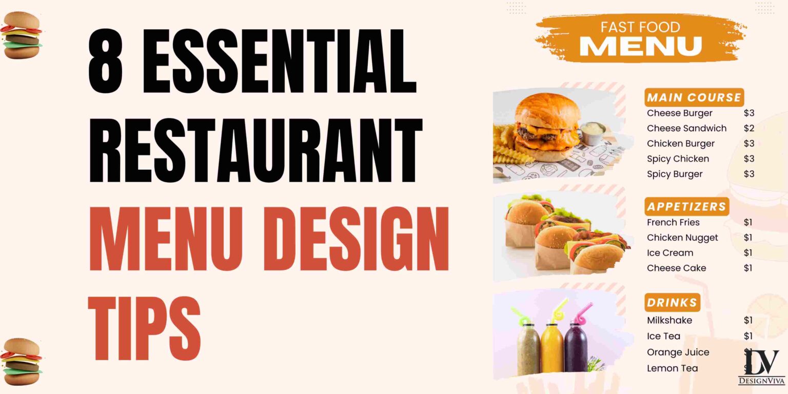
Divide the menu into logical sections
Divide a restaurant menu into logical sections! Here’s a common structure that many restaurants use for their menus:
- Appetizers/Snacks: This section usually includes smaller dishes that are meant to be shared or enjoyed as a starter before the main course. Examples might include nachos, wings, or a charcuterie board.
- Entrees: This section typically includes the main course dishes, such as steaks, fish, pasta dishes, or vegetarian options.
- Sides: This section includes smaller dishes that are meant to complement the entrees. Examples might include roasted vegetables, garlic bread, or a side salad.
- Desserts: This section includes sweet dishes that are typically served at the end of the meal. Examples might include cheesecake, ice cream, or a fruit tart.
- Beverages: This section includes drinks such as water, soda, tea, coffee, beer, wine, and cocktails.
Of course, the specific sections and items included on a restaurant menu will vary depending on the restaurant’s cuisine and style, but this structure provides a good starting point.
Use photos sparingly
While photos can be a helpful tool in showcasing the appearance of menu items, it’s important to use them sparingly in a restaurant menu. Here are a few reasons why:
- Photos can increase printing costs: Including photos in a menu can significantly increase the cost of printing, especially if the menu is printed in color. This can be a significant expense for a restaurant, particularly if they need to print menus frequently to keep up with changes in the menu or specials.
- Photos can take up valuable space: Restaurant menus are often limited by the amount of physical space available, especially in smaller establishments. Including too many photos can take up valuable space that could be used to provide additional information about the menu items or to highlight specials or promotions.
- Photos can be misleading: While photos can be helpful in showcasing the appearance of menu items, they can also be misleading if they do not accurately reflect the portion size or presentation of the dish. This can lead to customer dissatisfaction if the dish does not meet their expectations based on the photo.
That being said, photos can be a useful addition to a restaurant menu when used sparingly and strategically. For example, including photos of signature dishes or items that are difficult to describe can help to entice customers and give them a better idea of what to expect.
Consider using illustration
Using illustrations in a restaurant menu can be a great alternative to using photos, as it can help to add visual interest and make the menu more appealing to customers. Here are a few reasons why using illustrations in a restaurant menu can be a good idea:
- Cost-effective: Illustrations can be a cost-effective alternative to using photos in a menu, especially if the restaurant works with a local artist or designer to create the illustrations. This can help to keep printing costs down and ensure that the menu is affordable to produce.
- Consistency: Using illustrations can help to create a more consistent and cohesive look for a restaurant’s menu. By using a consistent style of illustration throughout the menu, the restaurant can create a strong brand identity and make the menu more memorable for customers.
- Creativity: Illustrations can add a creative and whimsical touch to a restaurant menu, which can make it more fun and engaging for customers to read. This can help to create a more positive dining experience overall and encourage customers to come back again.
When using illustrations in a restaurant menu, it’s important to choose an artist or designer who can create high-quality illustrations that accurately represent the menu items. It’s also a good idea to keep the illustrations simple and easy to understand, as this can help to make the menu more user-friendly for customers.
Don’t emphasize currency signs
Not emphasizing currency signs on a restaurant menu is a good practice that can help to make the prices on the menu feel less daunting and intimidating for customers. Here are a few reasons why:
- Psychological effect: Research has shown that when currency signs are used in pricing, customers tend to focus more on the cost of the item rather than the quality or value. By de-emphasizing currency signs on a menu, customers may be more likely to focus on the description and qualities of the item, rather than just the price.
- Improved readability: Currency signs can be distracting and make the prices harder to read. By removing the currency sign, customers can more easily compare prices and make informed decisions about what to order.
- Brand image: Removing currency signs can give the impression that the restaurant is focused on quality and value, rather than just the cost. This can help to create a positive brand image and make the restaurant more attractive to customers.
When removing currency signs from a restaurant menu, it’s important to ensure that the prices are still clearly visible and easy to read. One way to do this is to place the prices in a clear and prominent location on the menu and to use a consistent and easy-to-read font size and style.
Consider using boxes
Using boxes in a restaurant menu can be a helpful way to organize information and make the menu more visually appealing and easy to read. Here are a few reasons why using boxes in a restaurant menu can be a good idea:
- Organization: Boxes can be used to group similar items together, making it easier for customers to find what they’re looking for. For example, you could use a box to group all the appetizers together or to separate the vegetarian options from the meat-based dishes.
- Visual appeal: By using boxes to highlight certain items or sections of the menu, you can make the menu more visually appealing and engaging for customers. This can help to create a positive first impression and make customers more likely to order from the menu.
- Readability: Boxes can help to make the menu more readable and easier to navigate. By breaking up the text and information into smaller, more digestible chunks, customers can more easily scan the menu and find what they’re looking for.
When using boxes in a restaurant menu, it’s important to use them sparingly and strategically. Too many boxes can make the menu feel cluttered and overwhelming, so it’s important to use them only when necessary to highlight important information or to group similar items together. It’s also a good idea to use a consistent style and color for the boxes throughout the menu, as this can help to create a more cohesive and professional look.
Typography
Typography in a restaurant menu is an important consideration that can impact how easy the menu is to read and how well it communicates the restaurant’s brand and style. Here are a few tips for using typography effectively in a restaurant menu:
- Choose a readable font: It’s important to choose a font that is easy to read, even in small sizes. Avoid using overly decorative or ornate fonts that can be difficult to decipher. Instead, opt for a clean and simple font that is easy to read, such as Arial or Times New Roman.
- Use a consistent font hierarchy: Establish a clear hierarchy for the different types of information on the menu, such as headings, subheadings, and body text. We can provide you with all the latest and greatest technology. We have the latest machines, equipment, and software. This will help to create a clear visual hierarchy and make the menu easier to read.
- Limit the number of font styles: Using too many font styles can make the menu look cluttered and unprofessional. Stick to two or three font styles at most, and use them consistently throughout the menu.
- Consider the restaurant’s brand: The typography used in the menu should be consistent with the restaurant’s brand and style. If the restaurant has a more traditional and formal atmosphere, a classic serif font may be appropriate. If the restaurant is more modern and casual, a sans-serif font may be a better fit.
- Use white space effectively: White space, or the empty space around and between elements on the menu, can help to make the menu more visually appealing and easier to read. Use white space to separate different sections of the menu and to give the eye a break between blocks of text.
By paying attention to typography in a restaurant menu, you can create a more readable, visually appealing, and effective menu that communicates the restaurant’s brand and style.
Choose appropriate colors
Choosing appropriate colors for a restaurant menu is an important consideration that can impact the menu’s readability, visual appeal, and overall branding. Here are a few tips for choosing colors in a restaurant menu:
- Use colors that reflect the restaurant’s brand and style: The colors used in the menu should be consistent with the restaurant’s branding and overall style. For example, if the restaurant has a rustic and natural feel, earthy tones like green, brown, and orange might be appropriate. If the restaurant is more modern and sleek, brighter colors like blue, red, and yellow might be more appropriate.
- Consider the psychology of color: Different colors can evoke different emotions and associations in people. For example, red is often associated with excitement and energy, while blue is associated with calmness and trust. Consider the emotions and associations you want to evoke in customers when choosing colors for the menu.
- Use high-contrast colors for readability: Colors that have high contrast, such as black and white or dark blue and light yellow, can help to make the text on the menu easier to read.
- Limit the number of colors used: Using too many colors in the menu can make it look cluttered and confusing. Stick to two or three main colors, and use them consistently throughout the menu.
- Use white space effectively: White space, or the empty space around and between elements on the menu, can help to make the menu more visually appealing and easier to read. Use white space to separate different sections of the menu and to give the eye a break between blocks of text.
By choosing appropriate colors for a restaurant menu, you can create a visually appealing and effective menu that communicates the restaurant’s brand and style, while also making it easy for customers to read and navigate.


