
Animal logos are on a dream run in the logo design industry.
Animal logos have been popular for decades, but they’re taking over in 2022. Designviva has gathered 12 animal logo designs created on their platform to inspire your own future designs.
Animal logos are not just cute and adorable, but they can also be very powerful. They are used by many companies as a marketing tool to attract customers and build brand awareness.
A logo featuring an animal can cement your brand in your target audience’s heart, however, it’s important to understand that using an animal logo does not simply mean placing a cute puppy next to your brand name and calling it a day. Logos that work are logos that mean something, and even if you initially decide you want a certain species to symbolize your brand, you’ve gotta make it the star of your brand’s story to make it work.


01. Jaguar — The Wild Cat
Jaguar is a British luxury car manufacturer that has been producing vehicles since 1922. The cars they make are known for their sophisticated class and style, which is why they’re sought after by collectors and car enthusiasts alike.
The Jaguar logo, depicting a leaping jaguar, was introduced in 1945. The choice of animal was deliberate; it was meant to symbolize the manufacturer’s values: ambition, grace and power.
The logo of the car company also has two variations: a square emblem with the head of a jaguar and a round emblem with the face of the same animal. Both are used in the current range of Jaguar cars.
02. Lamborghini — The Taurus
Lamborghini, the Italian sports car manufacturer. Lamborghini, a brand founded by Ferruccio Lamborghini, was an attempt to compete with Ferrari. He was a Taurus and had a great fondness for bulls.
His inspiration for the brand came from his love for bullfighting: he wanted to create a car that could rival Ferraris in terms of performance and style.
The Lamborghini emblem is a gold-and-black bull’s head, in profile. Legend has it that Ferruccio Lamborghini created the emblem to promote the rivalry between his manufacturer and Ferrari.
But for now, let’s change the subject and talk about something else.
03. Animal Planet — The Elephant
The Discovery Channel’s Animal Planet channel is a great way to learn about animals, because it combines education with entertainment.
The TV network Animal Planet has a large international audience, with millions of households tuning in.
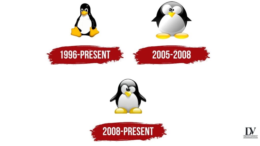
The channel’s original logo, featuring an Elephant, was first used in 1996. It was replaced by a redesigned logo in 2008. The current M-shaped symbol often appears onscreen accompanied by various animals.
In the ancient world, the elephant was a symbol of loyalty, dignity, and strength.
04. Linux — The Tux
Linus had an allegorical disease called “penguinitis” that made people “stay awake at night and feel great love towards penguins.” This disease was common among Finns who grew up near the sea, where penguins are most commonly found. Because of this disease, Linus grew up with strong feelings towards these animals—so when he got an email from David requesting help with the new operating system kernel project they were working on together, Linus immediately started coding without even knowing what it was about!
In 1991, Linus Torvalds and David Miller were students at the University of Helsinki. Torvalds had recently graduated from the university with a master’s degree in computer science and he was working on a project for his graduation thesis when he lost interest in it. Miller was interested in continuing the project and so he asked Torvalds to join him as a programmer. They started designing a new kernel, which eventually became known as Linux.
This logo is a perfect example of a logo not having to symbolize anything. It simply shows admiration for the species it represents, which has been around since 1996.
05. Lacoste — The Crocodile
Lacoste is a French clothing and footwear company that was founded in 1933. The Croc logo can be found on nearly everything the company manufactures – polos, shoes, leather goods, and sportswear.
The precursor to establishing The Croc as an emblem was a small story of René Lacoste, who was a tennis player at the time. Lacoste had a bet with his team captain about the abilities of crocodiles in terms of suitcase safety, and ten years before the foundation of his firm, he lost that bet.
Lacoste would have been given a brand new bag if he had won his game that day.
Lacoste’s performance at the tennis match was not what he expected, but the local journalist got wind of their wager and characterized his performance as “fighting like a true crocodile” in a newspaper article. This quote became Lacoste’s new alias and embroidery talisman.
06. Ferrari — The Prancing Horse
Ferrari, an Italian manufacturer of sports cars, is one of the world’s most recognized brands. The company was established in 1947 and has been in the business of building cars since that time (in an official capacity).
Ferrari never needed to redesign their logo, as the company had always had a successful brand identity.
The company logo, a black stallion prancing on a yellow background, was suggested by Paulina Barraca, the mother of Francesco Barracca (a World War I fighter plane ace who died in 1918). She had been told by Enzo Ferrari that he should use this image as a good luck charm on his racing vehicle. The logo remained roughly untouched ever since.
The prancing horse, a symbol of speed and power, is a fitting legacy for Ferrari. All cars manufactured by the company are thought of as being very fast, ferocious, and untamable. Just like a wild stallion.
07. SharkBoost Logo
If you’ve been looking for a logo design that’s just the right combination of energy and creativity, look no further. This logo is guaranteed to get your audience excited about your brand!
The high-energy shark design with text perfectly matches the main symbol, and with unlimited color combinations possible, there’s no limit to how many colors you can use.
It’s easy to customize the colors to fit your logo design needs.
08. Woodchuck Apparel
For a long time, beavers were not considered cute animals. They were considered as dangerous animals that could damage your house and ruin your garden. However, in the last decade, they became quite popular.
Beavers have been present in many TV-shows and cartoons, including The Angry Beavers, Narnia Chronicles and Ice Age. These animals are known for their funny behavior and witty jokes. As you can see, these animals always add some amusement everywhere they appear. A logo design is no exception!
Woodchuck Apparel has created a brand identity that creatively combines the beaver with sunglasses made of wood. The logo designer uses a beaver that looks so stylish, people will think a beaver-themed clothing line must have launched recently.
The main idea is to combine elements of nature with a modern style that will not only appeal to people who like walking in the woods or just enjoy spending time outside but also to those who are looking for a unique product that can become part of their everyday life.
09. Geek Monkey Logo
We’re Designviva, and we love design.We’re a small, passionate team of designers who are always looking to make things better. We’re not afraid of hard work and we just want to make awesome stuff for you.
The fashion-savvy are at the forefront of great design and technology. So show off your love for the style and brains behind these innovations with this fun monkey logo design. This logo features a sleek design that can be easily changed to reflect your unique brand. Choose between the energetic lime green or any color you desire.
This logo is perfect for business owners looking to show their love for technology and design, or even just anyone who wants to show off their geek side!
10. Puma
The logo features a puma, the elegant hunter renowned for its jumping ability. The logo was designed by Karl Oster within the company’s early years because founder Rudolf Dassler had been nicknamed Puma during his university days.
The logo for Puma is simple and effective. It depicts a puma performing a jump, which makes it seem powerful, athletic, and aggressive. Any sports fan can relate to the logo, because they want to feel like they are jumping just as powerfully as this cat is jumping.
In order to increase its appeal and boost sales, Puma often concentrates on creating a series of striking adverts featuring famous sportsmen. For example, a commercial trailer starring Antoine Griezmann, the best French football player and brand ambassador. He shot a trailer parodying his own victory gesture, which resulted in millions of income for the company.
11. Mozilla Firefox Logo
After the decline of Netscape, the Mozilla project adopted a new logo. The original logo was a phoenix reborn from its flames, but they had to change it because it was not well known on the web at the time.
A red panda can be found on the Mozilla Firefox logo. Unfortunately, many people thought that the animal on the Mozilla Firefox logo was a fox; however, this is actually a red panda, a protected species in Asia. Translating red panda from Chinese to English led to the mistake of calling firefox a “fox” when it actually refers to a red panda.
Since 2004, the Mozilla Firefox logo has not changed much. It is still very similar to the original—too similar, some people say. The current logo has been seen in five different versions over the years, and most people agree that the logo has been simplified over time.
12. Chicago Bulls
The Chicago Bulls are a renowned basketball team from Chicago, founded in 1966 and currently competing in the National Basketball Association (NBA). They play in the Eastern Conference Central Division.
In addition to the distinctive color scheme of black and red, the Chicago Bulls’ logo was created using Dick Klein’s high school colors. Wessel was asked to make the logo as aggressive as possible, but he did not overdo it and it turned out to be adequate and relevant for all times. It is worth noting that, given Klein’s inexplicable attraction to slaughterhouses, it was at his request that drops of blood were added to the horns.
The Chicago Bulls logo, with its bold colors and fearsome image, reflects the team’s readiness to achieve and maintain success in a lifetime of uncompromising fight.
In summary, old designs can be easily adapted to the modern age by making a few small changes.
What will the future hold in regard to animal logos? No one can predict the future, but if past and present are any indication, designers and artists will continue to use them. These symbols of animals have timeless appeal, and they will always be relevant.


