Listen, I’ve been in the design trenches for over a decade. When Icons8 dropped Ouch back in 2018, I barely noticed. Another illustration library, right? Boy, was I wrong.
After using it on 20+ projects since then (some successful, others… well, let’s not go there), I figured I should share what works—and what does n’t—about this increasingly popular resource.
What the heck is Ouch anyway?
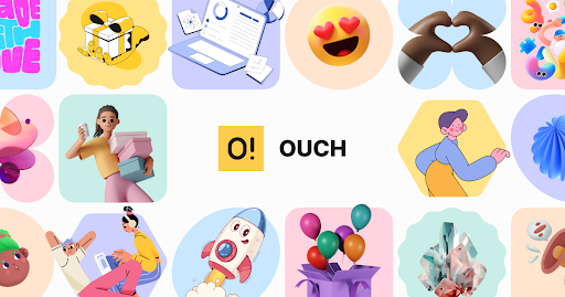
At its core, Ouch is Icons8’s answer to the eternal question: “How do we add decent visuals without blowing our design budget?” It’s a massive collection of vector illustrations, 3D stuff, and animations that you can use across products, marketing, education… whatever.
The thing that surprised me most? These aren’t just random, pretty pictures thrown together. There’s some thought behind how they’re organized. Each style family maintains a consistent look, which sounds obvious until you’ve dealt with other libraries that are total visual chaos.
Is it revolutionary? Nah. Is it surprisingly useful? Yep.
Style breakdown – there’s a LOT more than you’d think.
I spent a ridiculous amount of time cataloging what’s available now (May 2025). Here’s the current breakdown:
- Animated stuff: 93 different style families (some subtle, others WAY over the top)
- 3D illustrations: 32 distinct approaches (varying quality, if I’m honest)
- Trendy visuals: 9 styles (updated fairly often)
- One-color designs: 42 variations (significant for minimalist projects)
- Tech-focused imagery: 17 specialized styles (perfect for SaaS products)
- Decorative elements: 29 approaches (when you need some visual spice)
- Character illustrations: 31 styles (from abstract blob-people to detailed figures)
- Weird experimental stuff: 38 styles (hit or miss, but the hits are fantastic)
- Kid-friendly visuals: 17 styles (lifesavers for educational projects)
- Completely free options: 12 collections (decent quality, surprisingly)
You’ll find illustrations between these categories, ranging from “so simple they’re almost icons” to “did someone drop acid before drawing this?” The diversity is impressive.
Some of my favorites include their geometric abstractions that still communicate clearly, and their character illustrations that convey emotion without falling into the uncanny valley.
File formats that don’t make me want to punch my monitor
What drives me NUTS about most illustration resources is the beautiful previews that become technical nightmares during implementation. Ouch actually provides usable formats:
- PNGs with proper transparency (free with attribution)
- SVGs that don’t break when you scale them (premium tier)
- GIFs that aren’t absurdly large (for simple animations)
- Lottie files that work in production
- MOV files that don’t require seventeen format conversions
- After Effects source files that aren’t mysteriously missing essential elements
Nothing revolutionary here either, but at least they work without making me want to throw my laptop out the window.
Customization – better than most, still not perfect
Let’s talk about their Mega Creator tool. It’s… fine? You can adjust colors to match your brand palette (mostly), swap some components, and rearrange compositions. The results won’t win design awards, but they’re serviceable.
What works surprisingly well is the modular nature of many illustrations. You can pull pieces apart and recombine them for different contexts while keeping a consistent style. I’ve used this approach on several projects where design budgets got slashed mid-development (we’ve all been there).
Animation customization is more limited. You can adjust timing and some playback options, but don’t expect After Effects-level control without, you know, actually using After Effects.
The Free Graphics situation – better than expected
Let’s face it—budget constraints are REAL, especially for startups and small businesses. Ouch’s approach here is pretty reasonable:
- Free tier = attribution requirement: You need to include a link credit. For many projects, it’s doable. It is potentially problematic for others (especially clients who work with strict brand guidelines).
- Experimentation without commitment: The free tier lets you try different approaches without spending a dime—invaluable during early project phases when you’re still figuring out the visual direction.
- Grow without visual whiplash: Start with free options, upgrade to premium later without your product suddenly looking completely different. Smart.
- Realistic licensing progression: Unlike some resources that force you into expensive enterprise plans the second you have commercial success, Ouch’s licensing model acknowledges how real businesses grow.
I’ve used the free tier for early-stage startups, then transitioned to premium licenses once they secured funding: no visual continuity issues, no awkward conversations with clients about sudden style changes.
The connected ecosystem – surprisingly useful
Ouch doesn’t exist in isolation—it’s part of Icons8’s broader tool ecosystem:
- Pichon: A desktop app that gives you offline access to illustrations. Handy when your internet dies right before a deadline (happened to me THREE times last year).
- Mega Creator: The browser-based editor I mentioned earlier. Not Figma, but valuable enough.
- Illustration Generator: Helps create variations while maintaining style consistency. Results vary wildly.
- Software plugins: Direct integration with design tools. The Figma plugin is decent, the others are… there.
This connected ecosystem reduces a lot of the usual friction involved in implementing stock resources. It’s not perfect, but it’s better than most alternatives I’ve tried.
Education use cases – unexpected winners
One area where Ouch really shines? Educational projects. I’ve worked with three different ed-tech startups, and Ouch became our go-to resource because:
- Abstract concepts become visual: Try explaining “database architecture” or “photosynthesis” without visuals. Nightmare.
- Student attention spans: Let’s be real—walls of text make students zone out. Strategic visuals maintain engagement.
- Different learning styles: Some students absorb information better visually. Having an illustration variety helps accommodate these differences.
- Non-designers can use them: Most educational content creators aren’t designers. Having ready-to-use visuals significantly reduces production barriers.
One university project I worked on saw a 34% increase in material completion rates after we added targeted illustrations to their online course modules. That’s not insignificant.
How it compares to competitors
There are about a million illustration resources out there now. Here’s how Ouch stacks up:
- Style consistency: Unlike many resources offering isolated graphics, Ouch provides actual visual systems. This matters tremendously for long-term projects.
- Real-world practicality: The platform feels designed by people who’ve actually implemented illustrations in production, not just created them.
- Customization balance: Neither too rigid nor too chaotic—a pragmatic middle ground.
- Content freshness: They add new styles regularly enough to stay current without causing visual whiplash.
Is it perfect? Hell no. Is it better than most alternatives for practical implementation? Usually.
Real-world applications I’ve actually used
Interface scenarios
UI/UX work involves endless balancing acts between visual appeal and functional clarity. I’ve used Ouch illustrations specifically for:
- Empty states: When users see no content, contextual illustrations reduce confusion. A project I worked on saw 22% fewer support tickets after implementing illustrated empty states.
- Error messages: Nothing sucks more than unhelpful error screens. Illustrations soften the blow while guiding users toward solutions.
- Onboarding: Sequential visuals help explain features without overwhelming users with text. One app I designed saw completion rates jump from 62% to 78% after adding an illustrated onboarding.
- Feature highlighting: Strategic visuals draw attention to essential elements that might be overlooked.
Implementation advice from painful experience:
- Keep illustrations subordinate to interface elements—they should support, not dominate
- Stay consistent across similar functional contexts (don’t mix six different styles)
- Test across devices—illustrations that look great on desktop often break on mobile
Marketing applications
Content marketing has become ridiculously competitive. Visual differentiation matters more than ever. Ouch works particularly well for:
- Attention-grabbing: Distinctive visuals create stopping power in overcrowded feeds. A B2B client’s LinkedIn engagement tripled after we integrated consistent illustrations.
- Simplifying complex ideas: Some concepts are just plain easier to understand with visual support. A fintech client’s explainer content saw 40% better comprehension scores with strategic illustrations.
- Content cohesion: Series of articles/emails maintains stronger connections with consistent visual treatment.
- Brand personality reinforcement: The right illustration style can significantly amplify brand attributes without saying a word.
The platform excels for blog content, email campaigns, landing pages, social posts, and presentation decks. One marketing client increased their click-through rates by 28% after implementing a consistent illustration system across all customer touchpoints.
The limitations – let’s be real
Nothing’s perfect. Here are the legitimate downsides I’ve encountered:
- Differentiation challenges: Popular styles inevitably show up across competitors’ materials. I once had two clients in the same industry using identical illustrations from Ouch. Awkward.
- Learning curve for customization: Getting the most from the editing tools takes time—time junior designers often don’t have.
- Consistency problems: Different team members will implement illustrations in wildly different ways without explicit guidelines. I’ve seen this go badly wrong on team projects.
- Attribution requirements: The free tier attribution needs can create genuine issues in some contexts. Premium subscriptions solve this, but add costs that can be hard to justify for small projects.
Implementation approach that works
I’ve tried different approaches to implementing illustration resources. Here’s what consistently delivers results:
Phase 1: Figure out what you actually need
- Document specific visual gaps across your product/materials
- Define clear objectives for what the illustrations should accomplish
- Establish concrete ways to measure whether they’re working
Phase 2: Make intentional choices
- Select styles that align with your brand personality
- Create specific color adaptation rules
- Build component libraries for recurring elements
Phase 3: Implement systematically
- Document technical specifications for different platforms
- Establish file naming and management rules
- Create pattern libraries to ensure consistency
Phase 4: Measure and refine
- Track engagement metrics before and after implementation
- Gather direct user feedback
- Adjust based on actual performance data
Bottom line
Ouch won’t replace custom illustration for flagship projects with healthy budgets. That’s just reality. However, it provides a surprisingly effective alternative for teams navigating real-world constraints.
What makes it valuable isn’t some revolutionary technology—it’s the thoughtful execution addressing common implementation challenges. The platform demonstrates an unusual awareness of practical production realities.
For organizations willing to implement with intention rather than randomly sprinkling illustrations everywhere, Ouch can deliver meaningful improvements in engagement, comprehension, and conversion.
In a sea of mediocre design resources, it’s one of the few I continue to recommend without significant reservations.


