Typography is an important element in commercial design work. It involves the selection, arrangement, and styling of type to create visually appealing and effective designs.
The choice of typography can have a significant impact on the message being conveyed, the audience, and the overall design aesthetic. A well-designed typographic composition can enhance the readability, legibility, and visual hierarchy of the text, making it easier for the audience to consume and engage with the content.
Moreover, typography can also help establish a brand’s identity and personality. For example, a bold and modern typeface may be suitable for a technology company, while a more traditional and elegant font may be appropriate for a luxury brand.
In short, typography is an essential element of commercial design work, and designers need to pay careful attention to the typography they choose to ensure the success of their designs.

What is Typography?

Typography is the craft and practice of arranging types to make written language readable and appealing. It involves the selection of typefaces, point sizes, line lengths, line spacing, and letter spacing, among other things. Typography can be used in a wide range of design applications, including print and digital media, such as books, magazines, posters, websites, and mobile apps.
Typography is not just about selecting a font or typeface, but also about creating a visual hierarchy and organizing information to guide the reader’s eye through the content. The way text is arranged can influence how readers interpret the message and navigate through the content.
Good typography can enhance the readability and legibility of text, making it easier for readers to engage with the content. It can also add visual interest and personality to a design, helping to create a unique and memorable visual identity.
Overall, typography is a crucial element in a design, and it requires careful attention and consideration to create effective and visually appealing designs.
Why is Typography important?
Typography is important for several reasons:
- Legibility and Readability: Good typography ensures that the text is easy to read and understand. The proper selection of typeface, size, line spacing, and other elements can significantly improve the legibility and readability of text, making it easier for readers to engage with the content.
- Visual Hierarchy: Typography can be used to create a visual hierarchy in a design, which guides the reader’s eye through the content and emphasizes the most important information. This helps to organize the information and make it easier to understand.
- Brand Identity: Typography plays a crucial role in creating a brand’s identity. A well-chosen typeface can convey a brand’s personality and values, helping to differentiate it from competitors and create a strong visual identity.
- Emotional Impact: Typography can also evoke emotions and set the tone for the content. Different typefaces and styles can create different moods and convey different messages, helping to engage and connect with the audience.
- Aesthetic Appeal: Good typography can make a design look more visually appealing and professional. The careful selection and arrangement of type can create a harmonious and cohesive design that is pleasing to the eye.
In summary, typography is important because it can improve legibility and readability, create a visual hierarchy, establish a brand’s identity, evoke emotions, and enhance aesthetic appeal. It is a crucial element in design that requires careful attention and consideration to create effective and visually appealing designs.
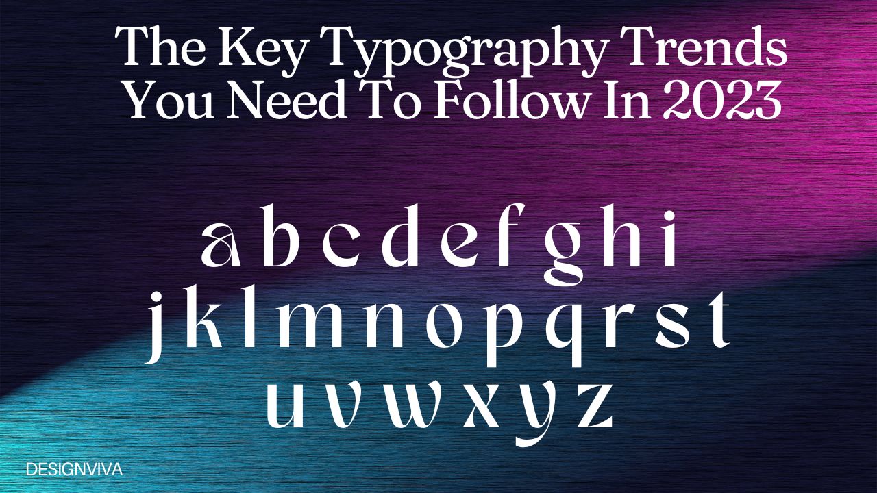
The following are the key typography trends that you should follow in 2023.
1. Hand-drawn fonts are intricate and detailed.

Hand-drawn fonts, also known as script fonts, are typefaces that mimic the look of handwriting or calligraphy. They are typically created by hand, using pens, brushes, or other drawing tools, and then digitized to create a font file.
Hand-drawn fonts can add a personal touch and a unique character to a design, making it stand out from other more traditional typefaces. They can also be used to create a vintage or retro aesthetic, depending on the style of the font.
Hand-drawn fonts can be used in a variety of design applications, such as branding, packaging, invitations, and greeting cards. They are often used in designs that require a more personal or informal touch, such as wedding invitations or greeting cards.
However, it is important to note that hand-drawn fonts can be less legible and readable than other more traditional typefaces. They may not be suitable for designs that require a lot of text or need to be easily readable in small sizes. It is also essential to choose a hand-drawn font that matches the overall style and tone of the design, as not all hand-drawn fonts are created equal and some may not fit the intended mood or aesthetic of the design.
2. Serifs have made a comeback in recent years.

Yes, that’s correct. Serifs have made a comeback in recent years, especially in digital design. Serifs are the small lines or flourishes that extend from the ends of the strokes of a letter in certain typefaces. They are often associated with more traditional or classic design aesthetics.
For a while, sans-serif typefaces were dominant in digital design because they were considered more modern and clean. However, as design trends have shifted towards more classic and vintage aesthetics, serif typefaces have become more popular again.
Serif typefaces can add a sense of elegance, sophistication, and authority to a design. They can also improve readability, especially in printed materials, by guiding the reader’s eye along the text. In digital design, serif typefaces can add visual interest and variety to a layout, helping to break up large blocks of text and create a more engaging user experience.
Some popular serif typefaces that have seen a resurgence in popularity include Times New Roman, Georgia, and Baskerville. Designers are also exploring more unique and contemporary serif typefaces that combine traditional elements with modern design techniques, such as variable fonts and unconventional ligatures.
Overall, the comeback of serif typefaces is a reflection of the cyclical nature of design trends and the desire for designers to create unique and engaging designs that stand out from the crowd.
3. Highlighted or underlined style of lettering

Highlighted style of lettering is a design technique that involves adding emphasis or a sense of depth to the letters by creating a highlighted or shadowed effect. This effect is achieved by adding a lighter or darker color, gradient, or texture to a portion of the letter, typically on one side or the bottom.
Highlighted lettering can be used to create a 3D effect, making the letters appear to be popping off the page or screen. It can also add visual interest and variety to a design, helping to draw attention to the text and create a more engaging user experience.
Highlighted lettering can be used in a variety of design applications, such as logos, posters, advertisements, and social media graphics. It is often used in designs that require a bold and eye-catching style, such as for event promotions or product branding.
It is important to use the highlighted lettering technique carefully and appropriately, as it can quickly become overwhelming or distracting if overused. The technique should be used in moderation and with consideration for the overall style and tone of the design.
4. Color fonts are making a comeback.

Color fonts are a relatively new technology that allows designers to use a wider range of colors and styles in their typography. While they have been available for several years, they have become more popular in recent times, as designers seek to create more engaging and dynamic designs.
Color fonts can be used in a variety of projects, including websites, mobile apps, digital advertisements, and print media. They are particularly useful for creating eye-catching headlines, logos, and other types of display text that need to stand out from the surrounding content.
One advantage of color fonts is that they can be used to create multicolored typography without the need for complicated layering or masking techniques. This can save time and streamline the design process, making it easier for designers to create bold and impactful typography.
In summary, while color fonts have been around for several years, they have become increasingly popular in recent times as designers seek to create more engaging and dynamic designs. They are a useful tool for creating eye-catching typography in a variety of projects, from websites to print media.
5. Animating Fonts

Font animation is a technique where typography is animated to create visual interest and add a dynamic element to the design. Animating fonts can bring a text to life and make it more engaging for the audience.
Several methods for animating fonts include:
- Motion Graphics: Motion graphics involves animating the text with the use of special effects, such as changing the size, shape, and color of the font. Motion graphics can create a sense of movement and add excitement to the typography.
- Kinetic Typography: Kinetic typography is a technique where the text is animated to match the rhythm and cadence of an accompanying soundtrack. This technique can be used to create dynamic and engaging videos.
- 3D Typography: 3D typography involves creating text that appears to exist in three dimensions. 3D typography can be animated to create visual interest and add depth to the design.
- Animated Handwriting: Animated handwriting is a technique where the text appears to be written or drawn by hand. This technique can add a personal touch to the typography and create a sense of nostalgia.
Overall, font animation can be a powerful tool for designers to create engaging and dynamic typography that captures the audience’s attention. When used appropriately, font animation can enhance the overall design and communicate the message effectively.
6. Rounded, simple sans serif font.

Rounded and simple sans-serif fonts are two popular categories of sans-serif typography.
Rounded sans-serif fonts are characterized by their soft, rounded edges, which can create a friendly and approachable look. These fonts are often used in designs that are meant to convey a sense of playfulness or whimsy. Some examples of popular rounded sans-serif fonts include Comic Sans, VAG Rounded, and FF Dax.
Simple sans-serif fonts, on the other hand, are characterized by their clean, minimalist lines and lack of decorative flourishes. These fonts are often used in designs that require a modern and professional look. Some examples of popular simple sans-serif fonts include Helvetica, Arial, and Open Sans.
Both rounded and simple sans-serif fonts can be effective in different design contexts. Rounded sans-serif fonts can be useful for creating designs that are meant to be approachable and fun, such as in children’s books or playful branding. Simple sans-serif fonts, on the other hand, can be effective in creating designs that require a clean and modern look, such as in web design or corporate branding.
Ultimately, the choice of font depends on the specific design context and the message that the designer is trying to convey. Both rounded and simple sans-serif fonts can be used effectively in the right context, and it’s important to choose a font that best fits the design’s overall aesthetic and purpose.
7. Fonts In Outlining

Outlining of fonts is a technique where a stroke or border is added around the edges of letters or characters in typography. This technique is also referred to as “stroking” or “contouring” the font.
Outlining of fonts can be used to create visual interest, add emphasis, or create a sense of depth to the typography. The stroke can be of varying thickness, color, and style, depending on the designer’s intent and the design context.
Some common uses of outlining of fonts include:
- Emphasis: Outlining a font can draw attention to specific words or phrases in a design, making them stand out from the rest of the text.
- Contrast: Outlining a font can create contrast between the text and the background, making the text easier to read and more visually appealing.
- Depth: Outlining a font can create a sense of depth to the typography, making it appear as if the text is popping out of the design.
- Branding: Outlining of fonts can be used as part of a branding strategy to create a distinct and recognizable visual identity.
It’s important to use outlining of fonts judiciously, as it can be overused and become visually overwhelming. When used appropriately, outlining of fonts can enhance the design and make the typography more engaging and impactful.
Conclusion
As of our knowledge cut-off date of September 2021, there were several emerging typography trends that were expected to continue into 2023. Here are some of the trends that could be seen in website design and other projects:
- Bold typography: Designers are using bold, heavy fonts to make a statement and grab viewers’ attention. These fonts can be used for headlines, titles, and other prominent text elements.
- Variable fonts: Variable fonts are a relatively new technology that allows designers to adjust the weight, width, and other characteristics of a font in real-time. This can be used to create dynamic and engaging typography that responds to user input or changes in the environment.
- Handwritten fonts: Handwritten fonts can add a personal touch to a design and create a sense of authenticity. These fonts can be used for headings, captions, and other text elements to create a more intimate and human feel.
- Experimental typography: Designers are experimenting with unconventional typography ideas to create unique and eye-catching designs. These can include distorted, layered, or otherwise manipulated typography that challenges traditional design conventions.
- Minimalist typography: Minimalist typography involves using simple, clean fonts and layouts to create a streamlined and modern design. This trend is particularly popular in web design, where minimalism can improve user experience and make a site easier to navigate.
Overall, typography is a crucial element of design, and designers are constantly exploring new ways to use it to create engaging and impactful visuals. These emerging typography trends are just a few examples of how designers are pushing the boundaries of what’s possible with type in 2023.


