
In the world of consumer electronics and technology, few names carry as much weight and history as Philips. Founded over a century ago, this Dutch multinational conglomerate has consistently been at the forefront of innovation, producing everything from light bulbs to healthcare equipment. One key aspect of the Philips brand identity is its logo and symbol, which has evolved over the years to reflect the company’s values and aspirations. In this article, we will delve into the meaning and history of the Philips logo and symbol.
The Evolution of the Philips Logo
Early Beginnings (1920s-1930s)
The earliest iterations of the Philips logo were relatively simple. In the 1920s and 1930s, the company used a circular emblem with the word “Philips” written inside it. This design was straightforward and functional, reflecting the company’s focus on electrical and lighting products during this period.
The Globe Emblem (1930s-1960s)
![]()


In the 1930s, Philips introduced a significant change to its logo by incorporating a globe. This globe represented the company’s expanding international presence and ambitions. The globe was encircled by the company’s name, giving the logo a distinctive and recognizable look.
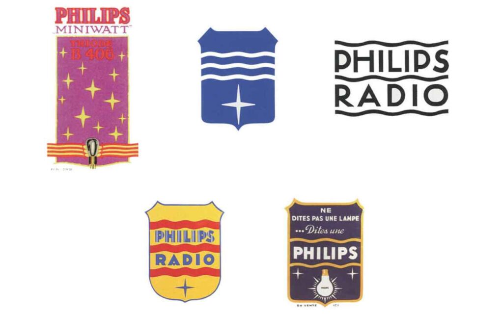
The Wave Design (1960s-1980s)
During the 1960s, Philips adopted a more abstract and modern logo design. The iconic wavy lines were introduced, which symbolized innovation, progress, and the dynamic nature of the company’s business. This design change reflected Philips’ transition from primarily a lighting company to a diversified electronics manufacturer.
The Current Emblem (1980s-Present)
![]()
In the 1980s, the Philips logo underwent another transformation. The globe was retained, but the wavy lines were replaced with a more simplified, streamlined design. The three bold, blue lines radiating outward from the globe symbolize the company’s commitment to innovation, progress, and improving people’s lives. The lines also form the letter “P,” signifying the Philips brand.
The Symbolism Behind the Philips Logo
![]()
The Philips logo is rich in symbolism, reflecting the company’s core values and mission.
1. Innovation: The ever-evolving design of the Philips logo signifies the company’s dedication to innovation and staying ahead in the rapidly changing tech industry.
2. Global Reach: The globe in the logo represents Philips’ global presence and its commitment to serving customers worldwide.
3. Progress: The dynamic lines in the logo represent progress and advancement, highlighting Philips’ role in shaping the future.
4. Customer-Centric: The blue color of the lines conveys trustworthiness, reliability, and the company’s focus on customer satisfaction.
5. Simplicity: The simplicity of the design aligns with Philips’ ethos of making technology accessible and easy to use.
Conclusion
The Philips logo and symbol have undergone a fascinating evolution over the years, mirroring the company’s growth and transformation. From its early beginnings as a lighting manufacturer to its current status as a global leader in healthcare, lighting, and consumer electronics, Philips has maintained a strong and meaningful brand identity through its logo.
The symbolism embedded in the logo reflects the company’s core values of innovation, global reach, progress, and customer-centricity. As Philips continues to innovate and adapt to the ever-changing technological landscape, its logo will likely continue to evolve, always representing the company’s commitment to improving people’s lives through meaningful innovation.


